library(hellodatascience)
library(tidyverse)Data Visualization
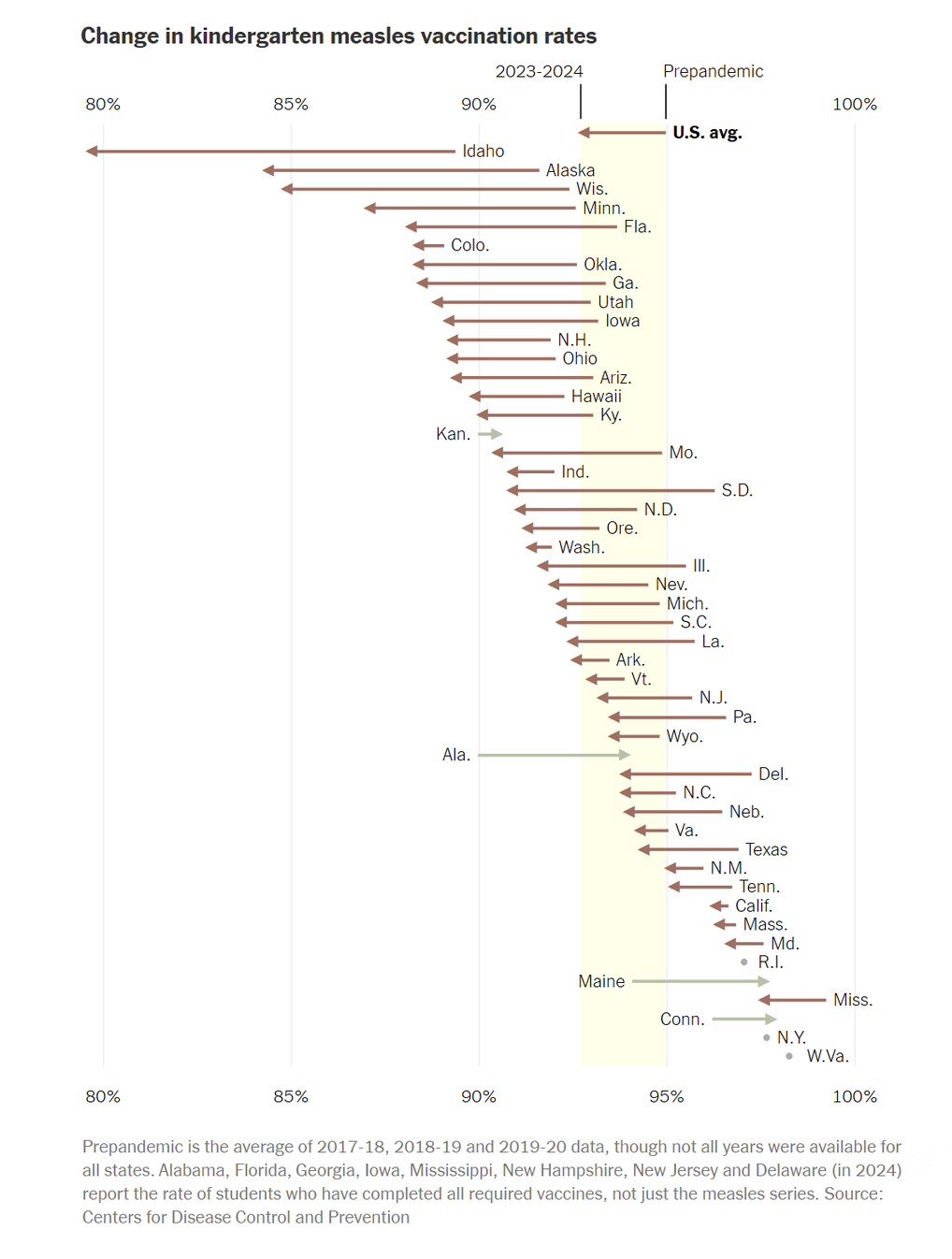
Example from NYT
Visualizing a ___ Variable
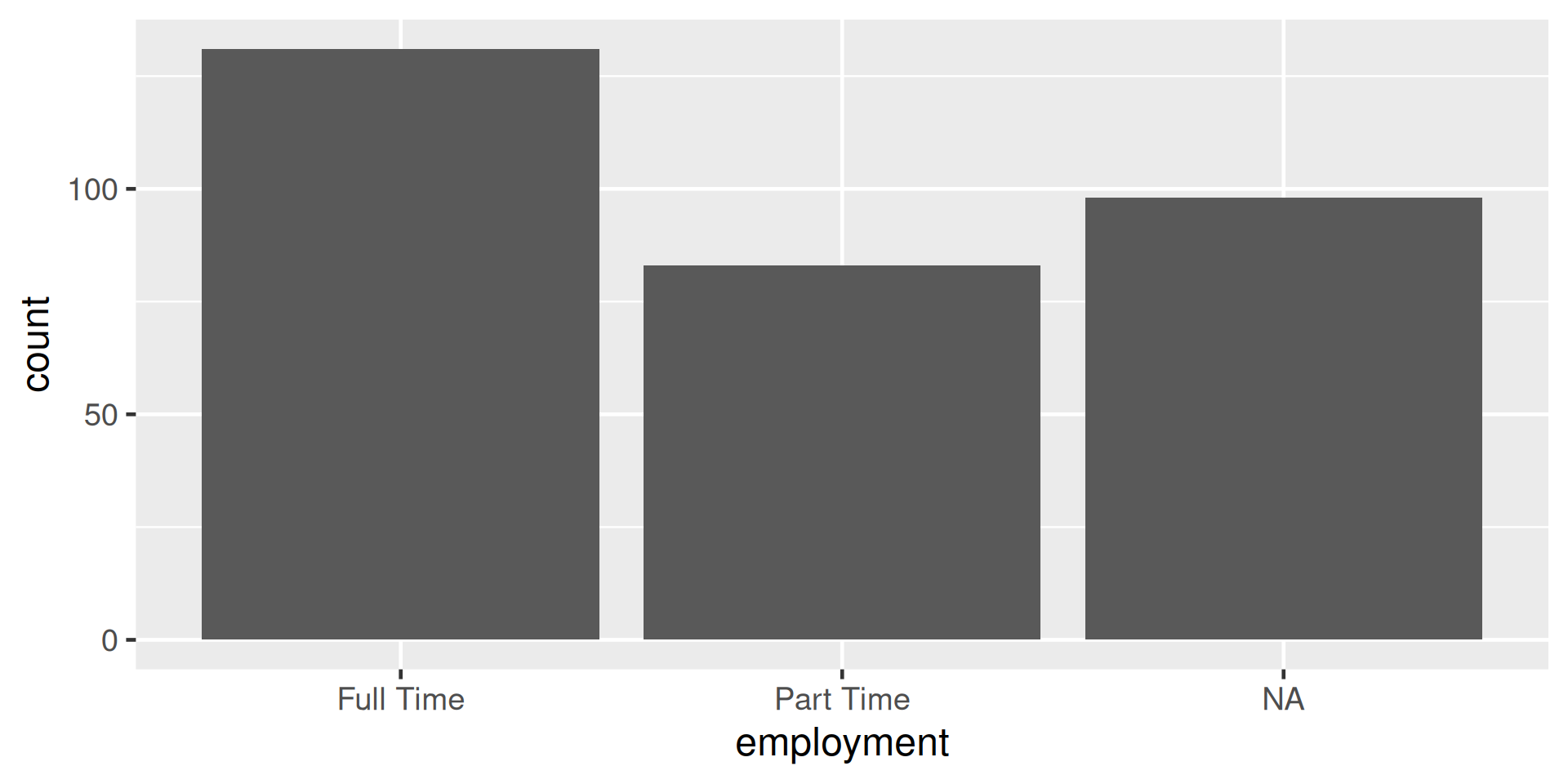
Figure 1: A bar plot of employment status
- What do you notice about this graph?
- If you could talk in English to R, how would you tell R to make this plot?
Pick your data
ggplot(data = atus_college)
Figure 2: Blank coordinate system
Map your variable
ggplot(data = atus_college, aes(x = employment))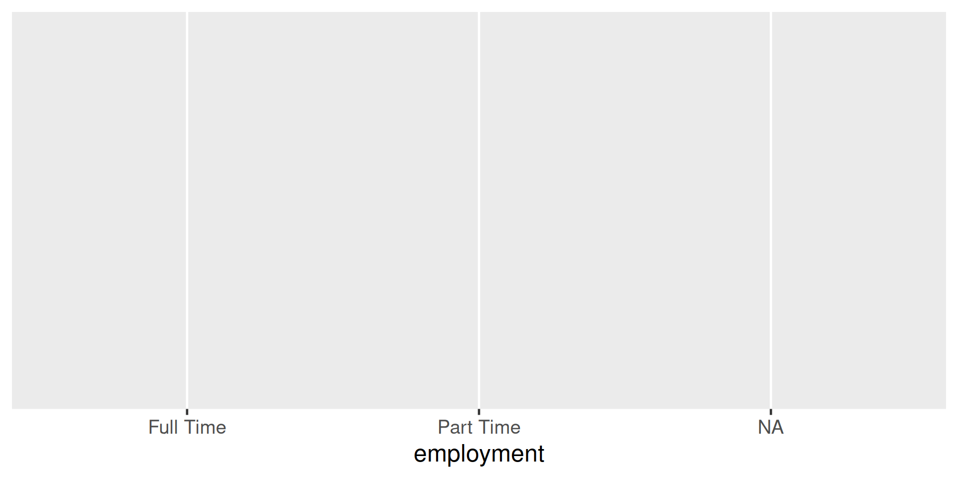
Figure 3: Mapping employment variable to the x-axis
Pick your plot type
ggplot(data = atus_college, aes(x = employment)) +
  geom_bar()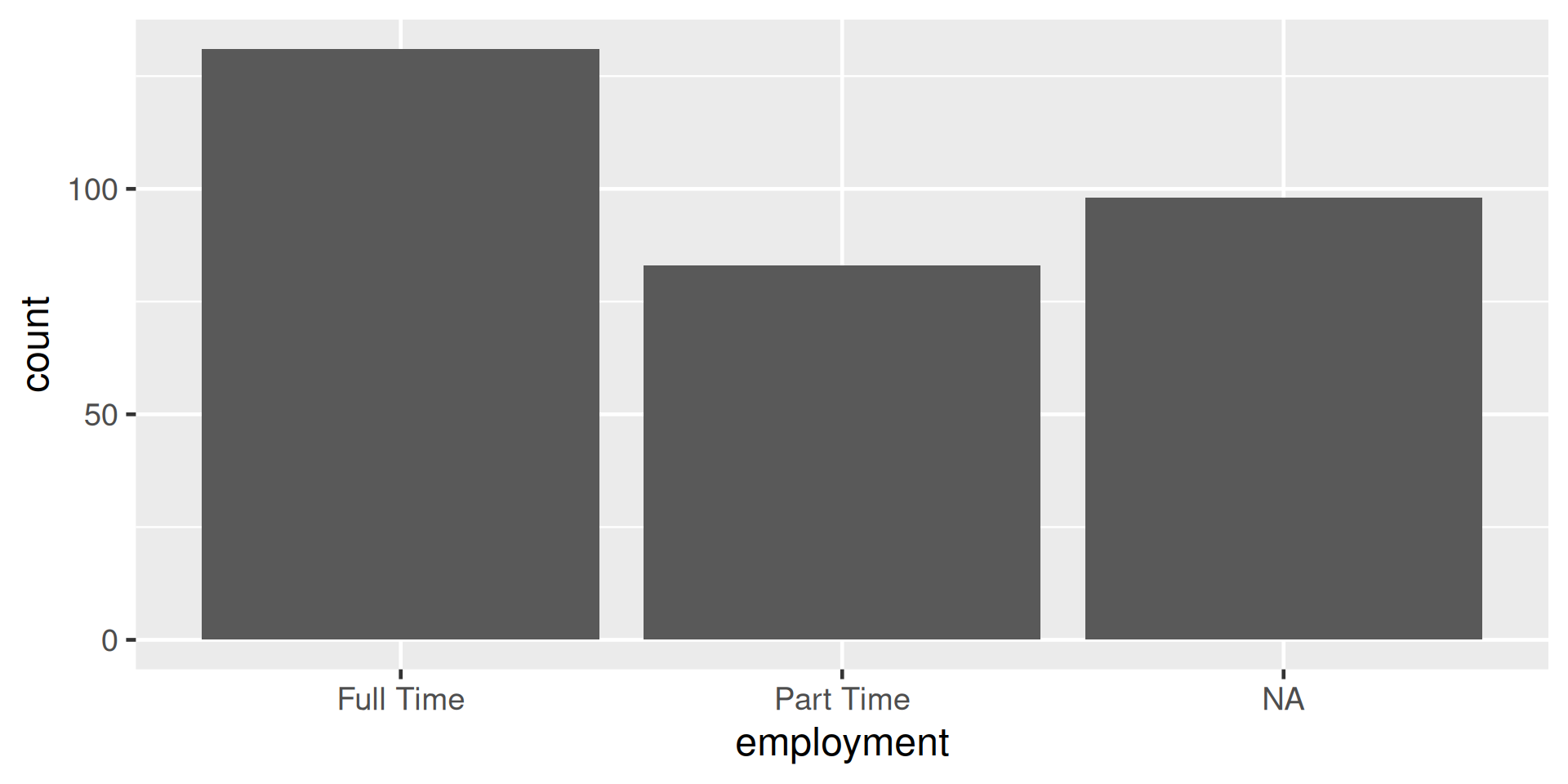
Figure 4: Creating the bars by adding the geometric layer of a barplot
Visualizing a Numeric Variable - Histogram
ggplot(data = atus_college, aes(x = weekly_earnings)) +
  geom_histogram()
`stat_bin()` using `bins = 30`. Pick better value `binwidth`.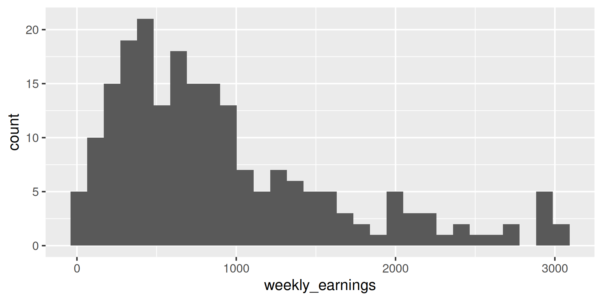
Figure 5: A histogram of weekly earnings
Comparing binwidth
ggplot(data = atus_college, aes(x = weekly_earnings)) +
geom_histogram(binwidth = 20) 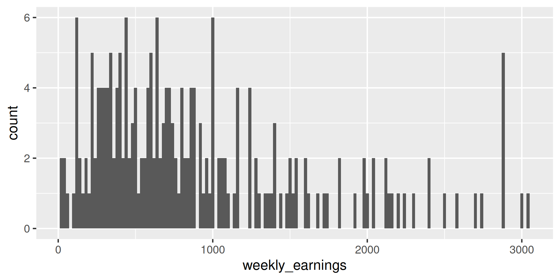
ggplot(data = atus_college, aes(x = weekly_earnings)) +
geom_histogram(binwidth = 100) 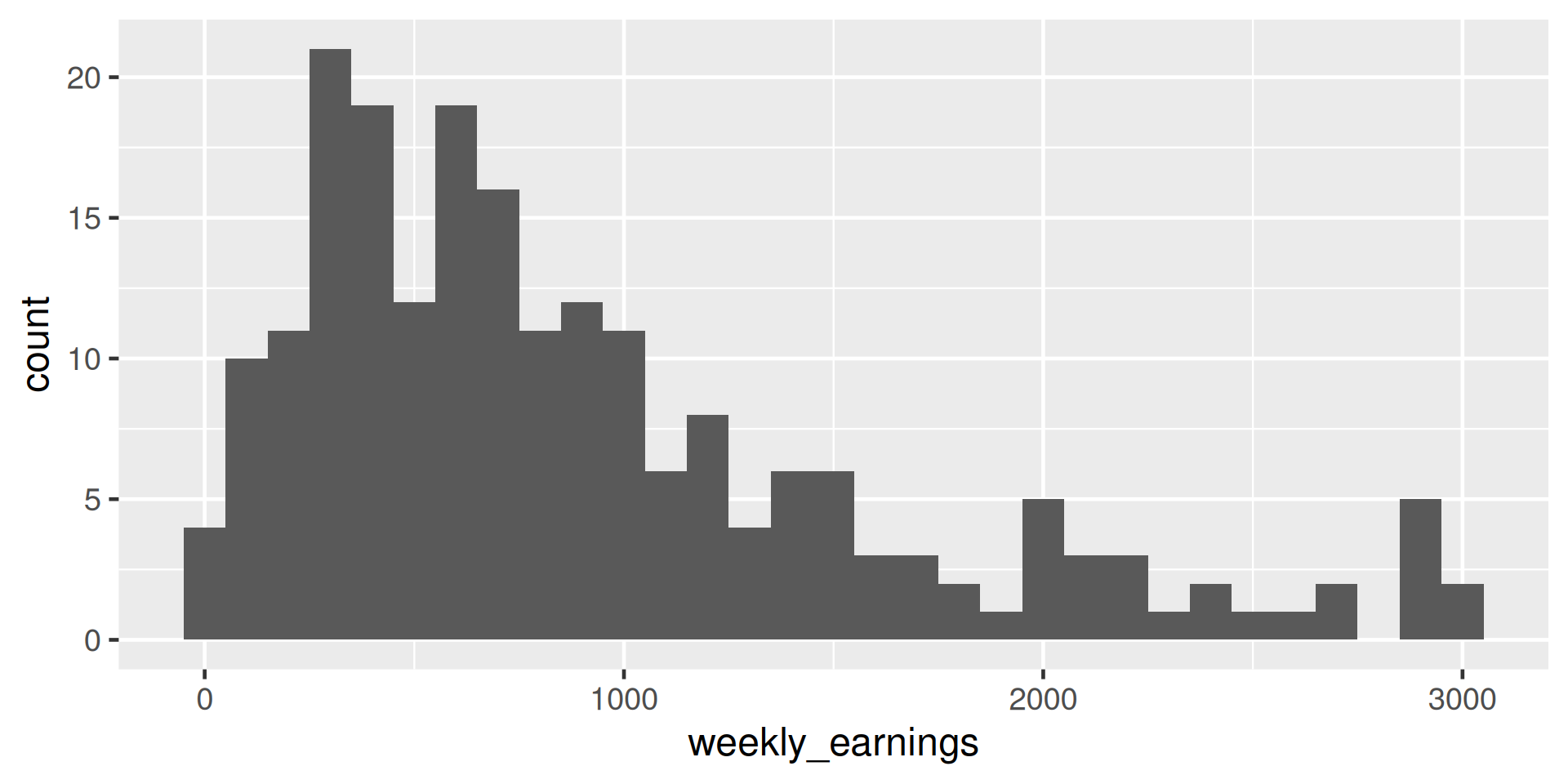
ggplot(data = atus_college, aes(x = weekly_earnings)) +
geom_histogram(binwidth = 500) 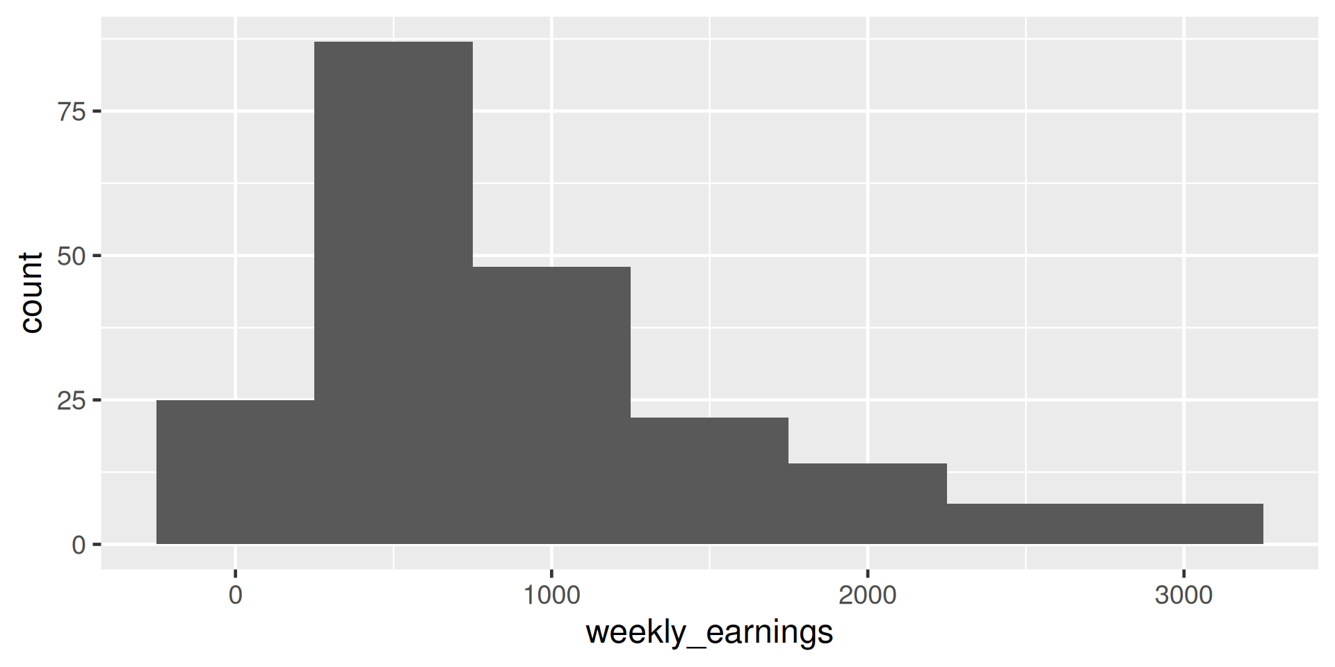
Describing histograms
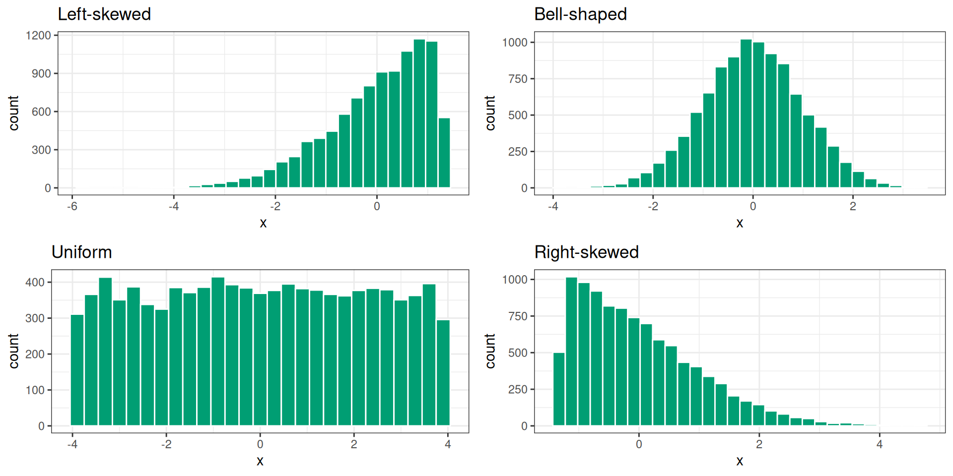
Figure 6: Understanding skewness of a histogram
Visualizing a Numeric Variable - Boxplot
ggplot(data = atus_college, aes(y = weekly_earnings)) +
geom_boxplot() 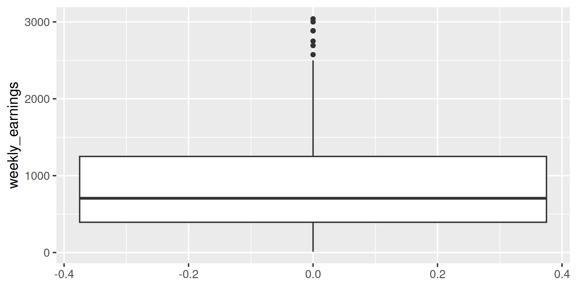
Figure 7: Boxplot of weekly earnings
Understanding Boxplots
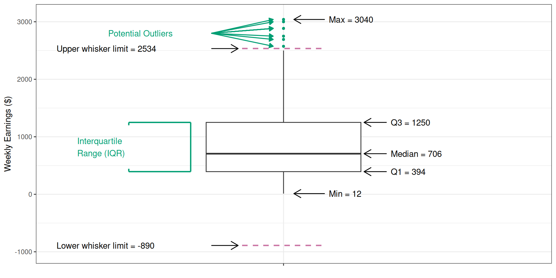
Figure 8: Annotated boxplot
Understanding Boxplots
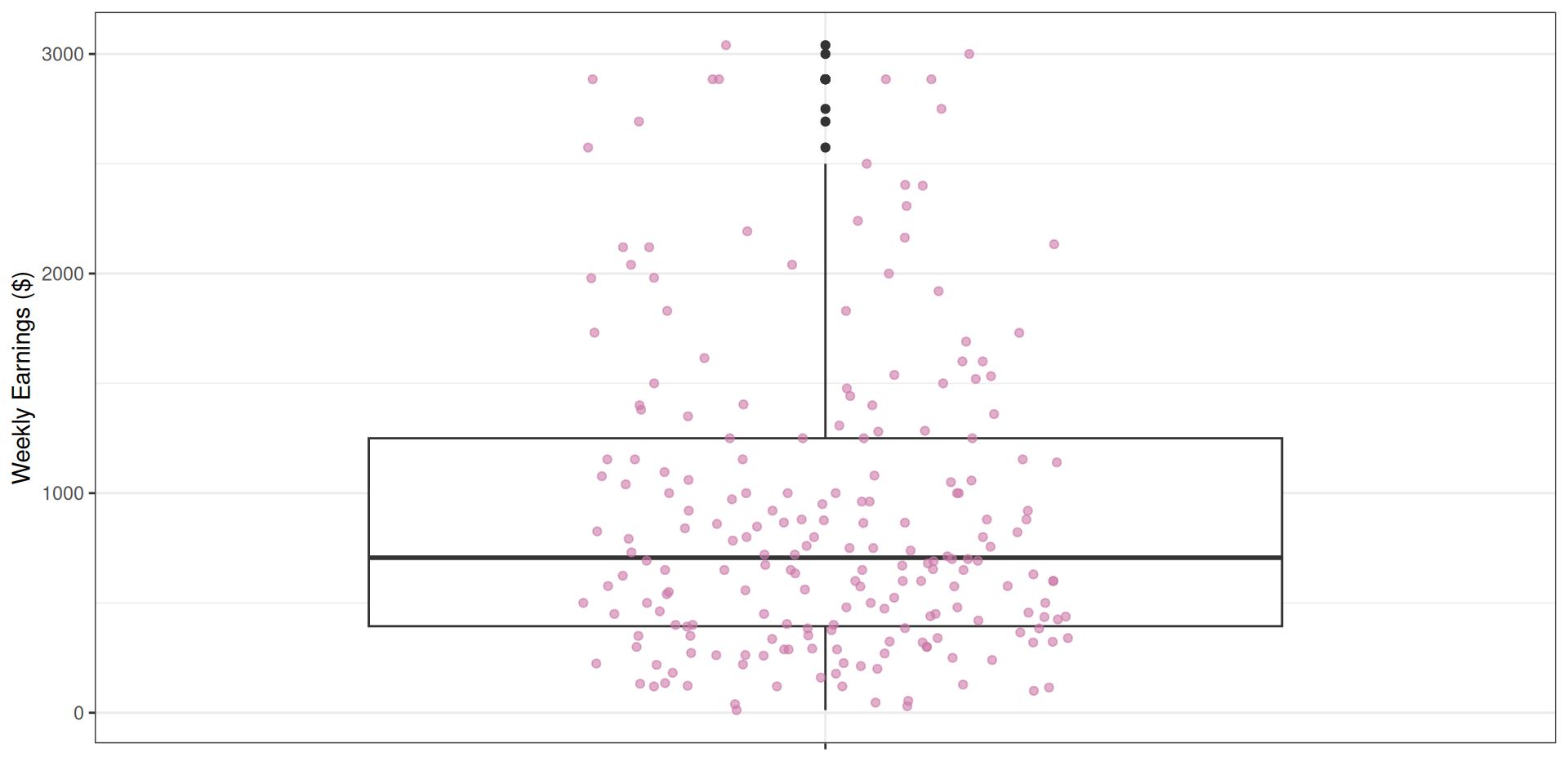
Figure 9: Boxplot overlayed with individual observation points
Stacked Bar Plot
ggplot(
  data = atus_college,
  aes(
    x = employment,
    fill = enrollment
  )
) +
  geom_bar()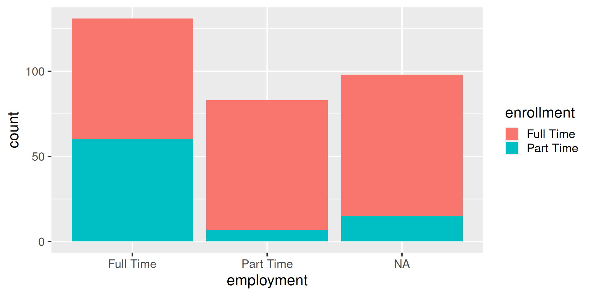
Standardardized stacked barplot
ggplot(
  data = atus_college,
  aes(
    x = employment,
    fill = enrollment
  )
) +
  geom_bar(position = "fill")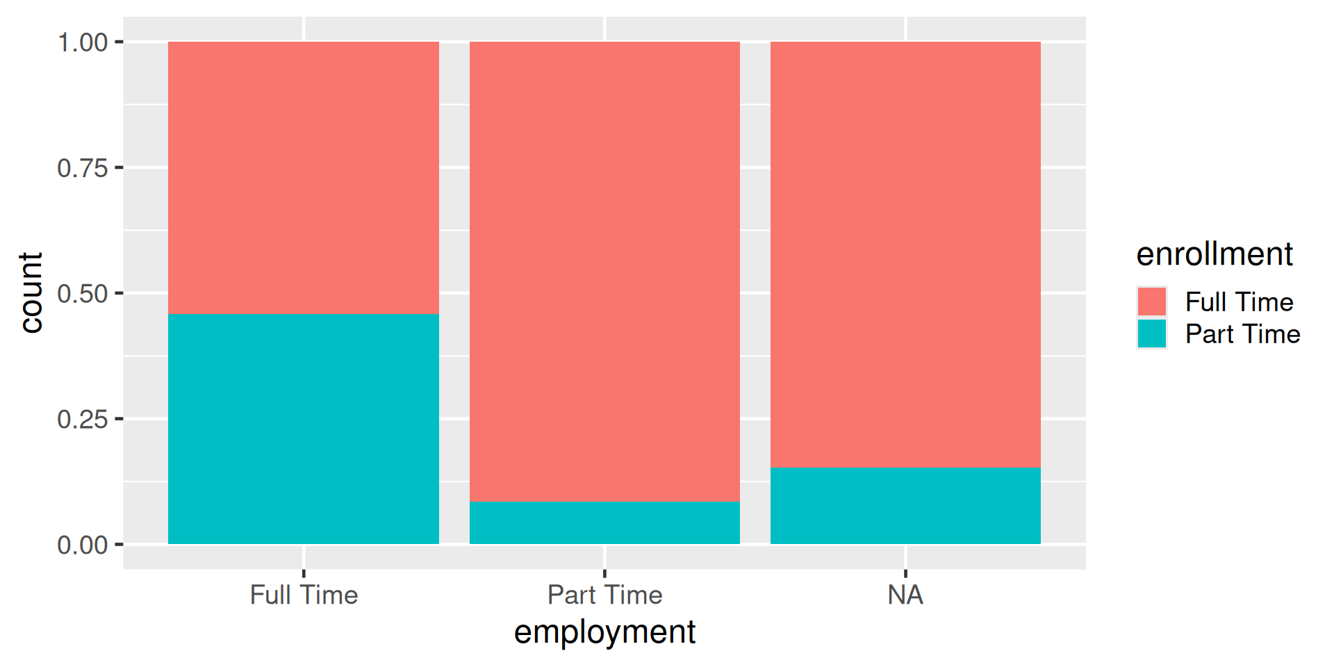
Dodged barplot
ggplot(
  data = atus_college,
  aes(
    x = employment,
    fill = enrollment
  )
) +
geom_bar(position = "dodge") 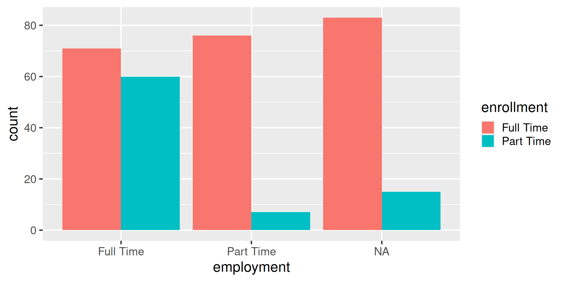
Scatterplot
ggplot(
  data = atus_college,
  aes(
    x = time_alone,
    y = weekly_earnings
  )
) +
geom_point() 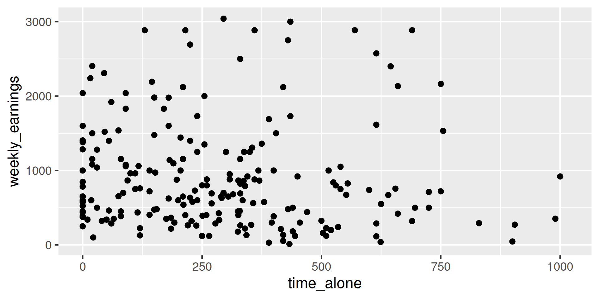
Side-by-side Boxplot
ggplot(
  data = atus_college,
  aes(
    x = employment,
    y = weekly_earnings
  )
) +
  geom_boxplot()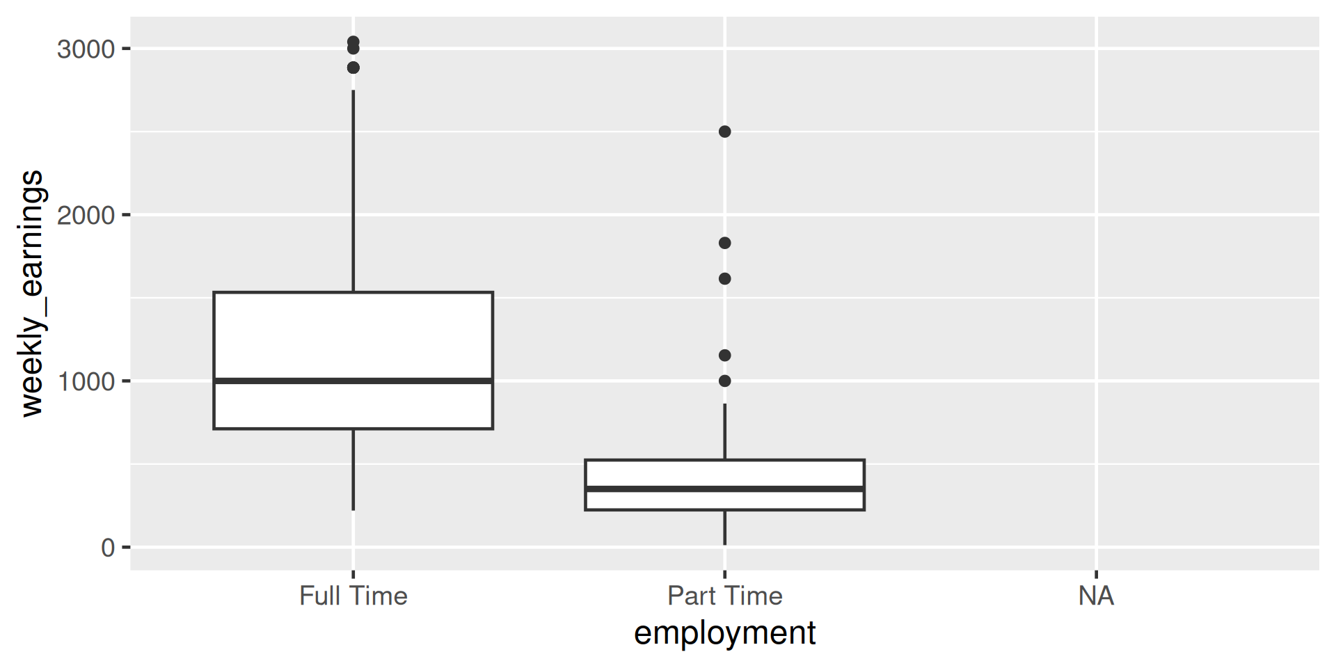
Use of color
ggplot(
  data = atus_college,
  aes(
    x = time_alone,
    y = weekly_earnings,
    color = employment
  )
) +
  geom_point()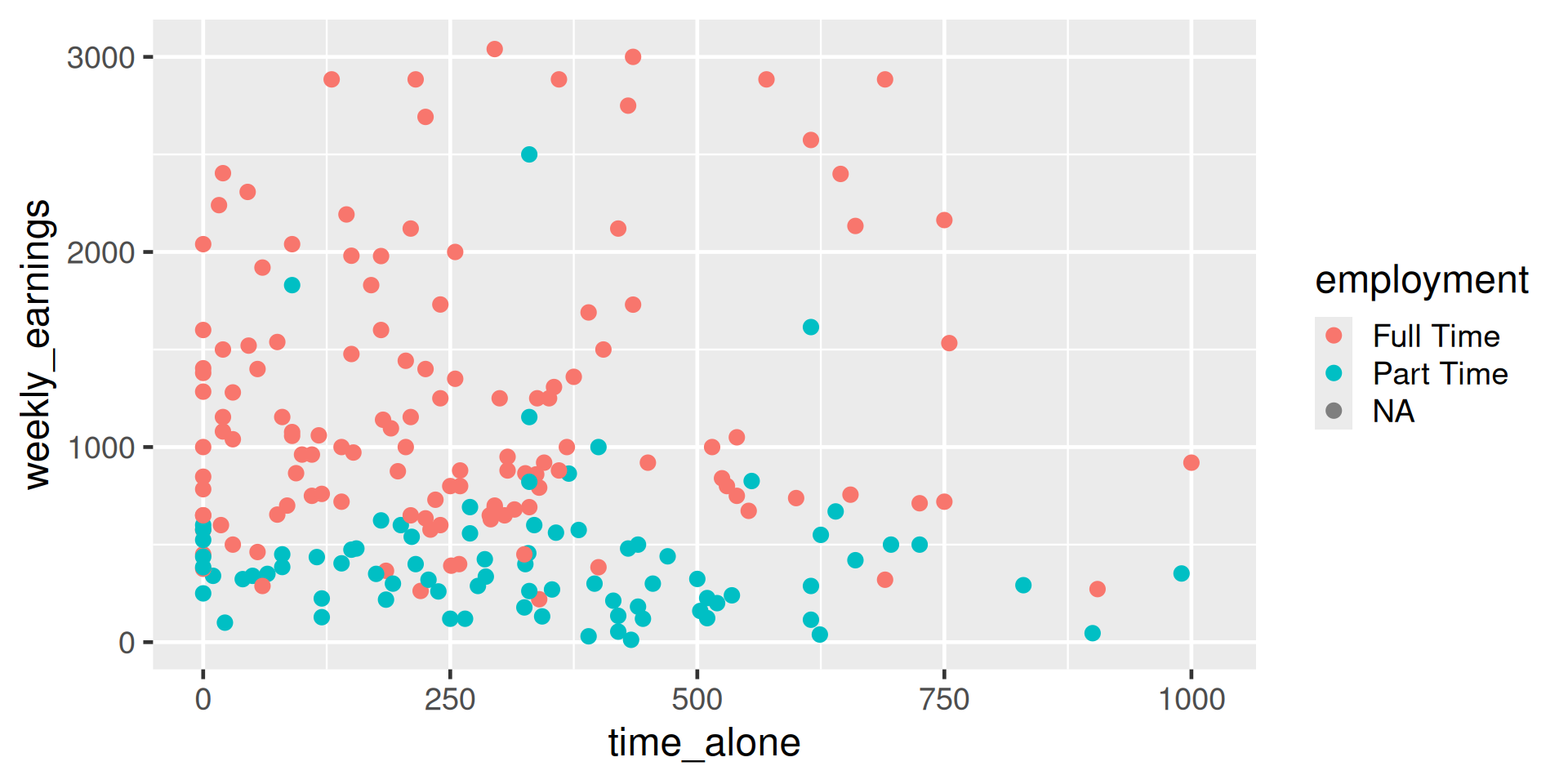
If you are color-blind, depending on the type, you may possibly not be able to distinguish these colors so the next slide will make much more sense.
Use of shape
ggplot(
  data = atus_college,
  aes(
    x = time_alone,
    y = weekly_earnings,
    shape = employment
  )
) +
  geom_point()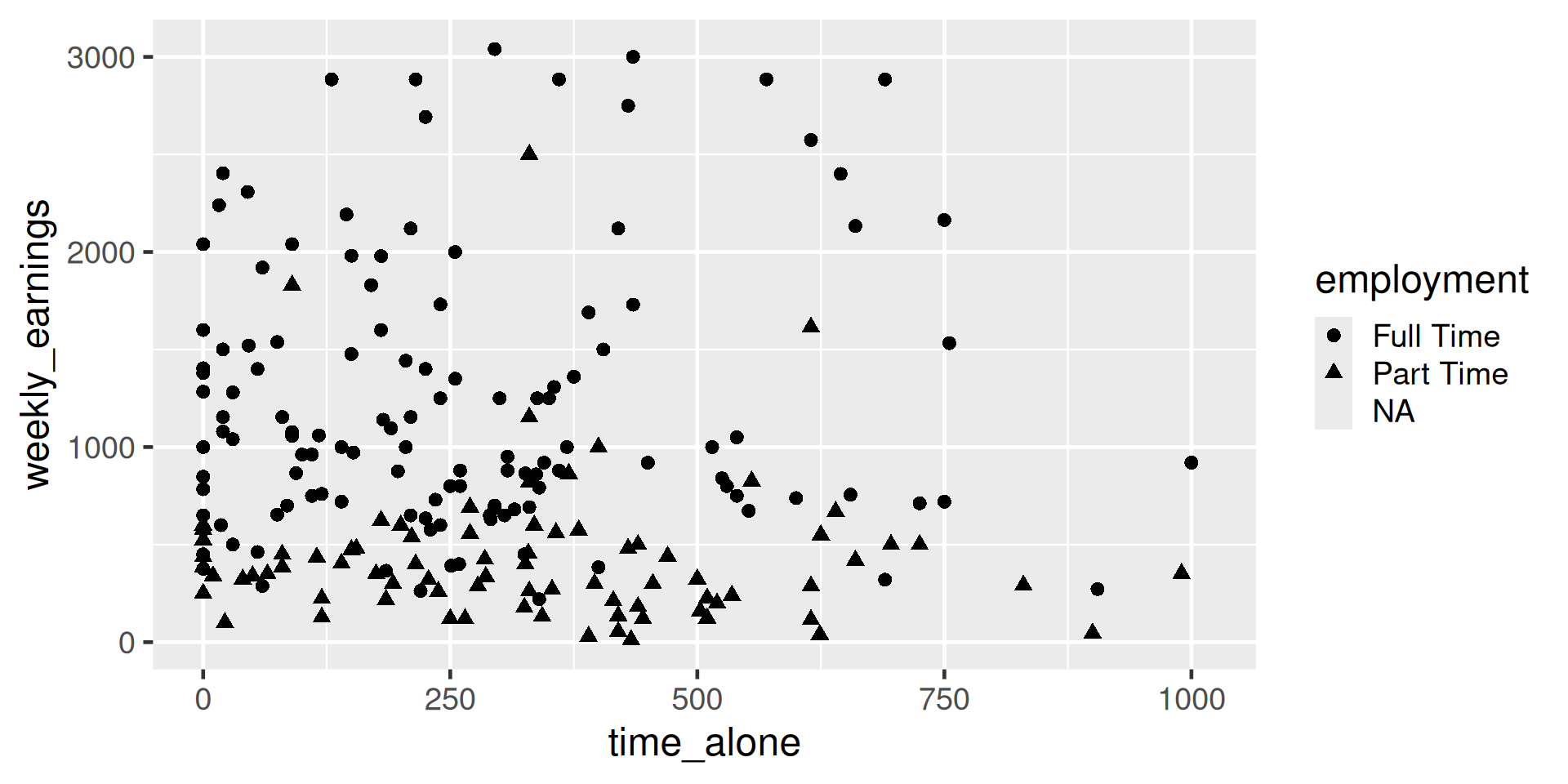
Use of color and shape
ggplot(
  data = atus_college,
  aes(
    x = time_alone,
    y = weekly_earnings,
    color = employment,
    shape = employment
  )
) +
  geom_point()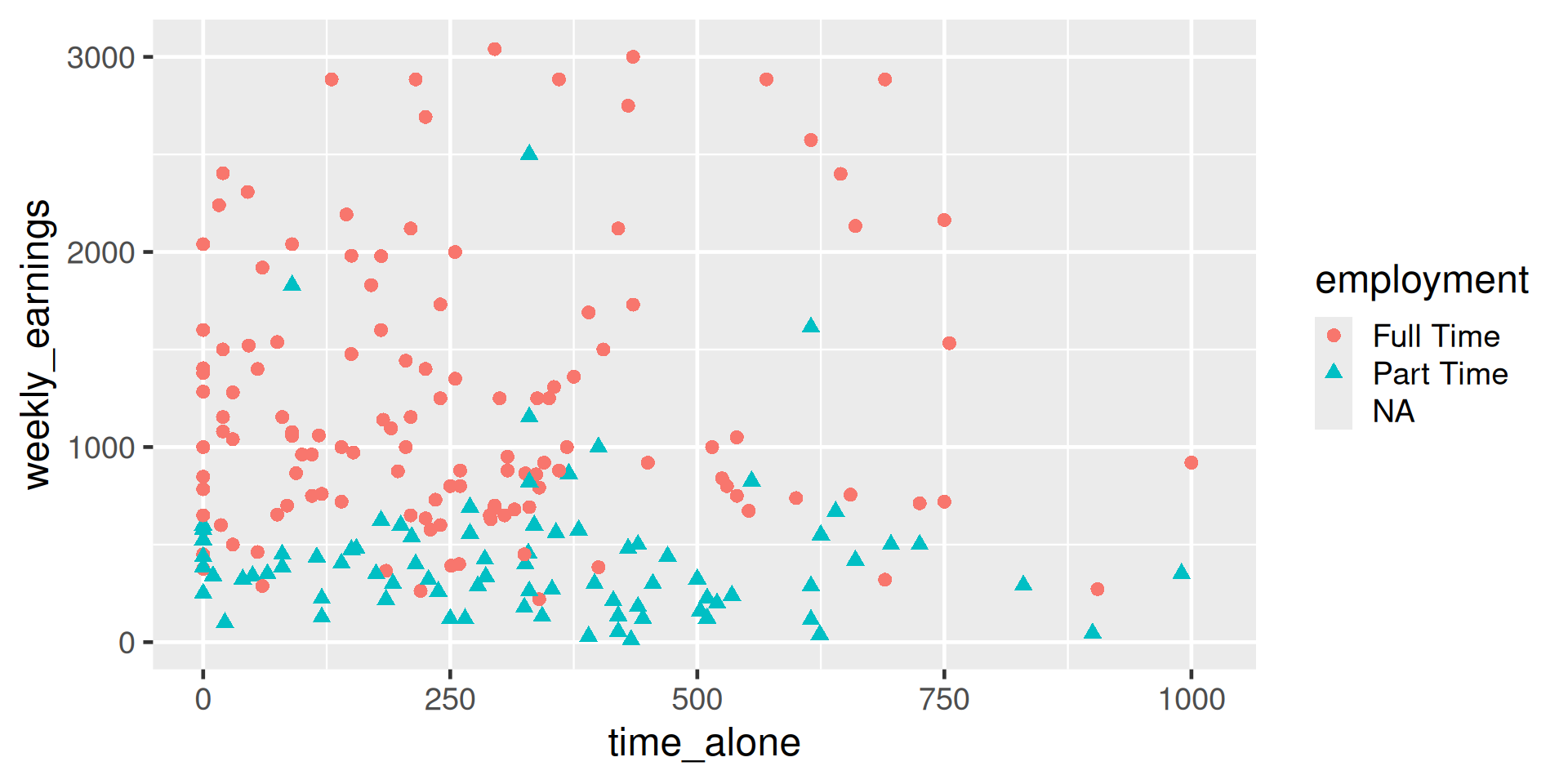
Use of size
ggplot(
  data = atus_college,
  aes(
    x = time_alone,
    y = weekly_earnings,
    color = employment,
    size = work_time
  )
) +
  geom_point()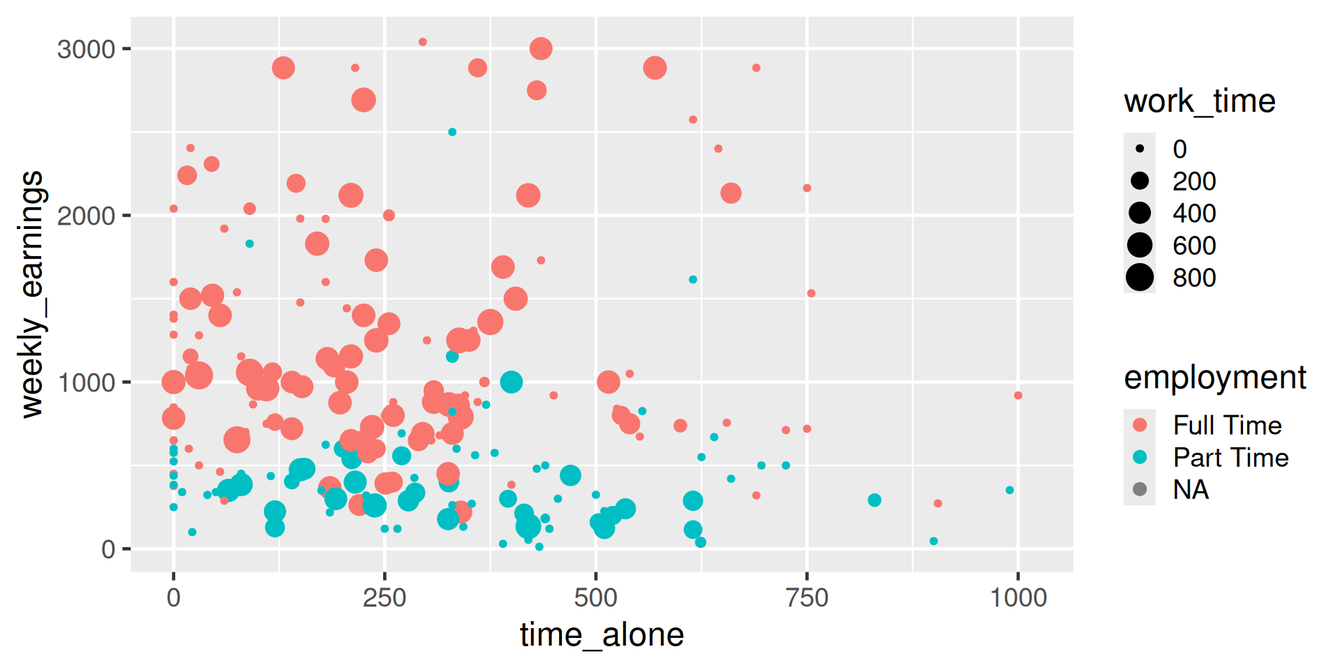
Summary
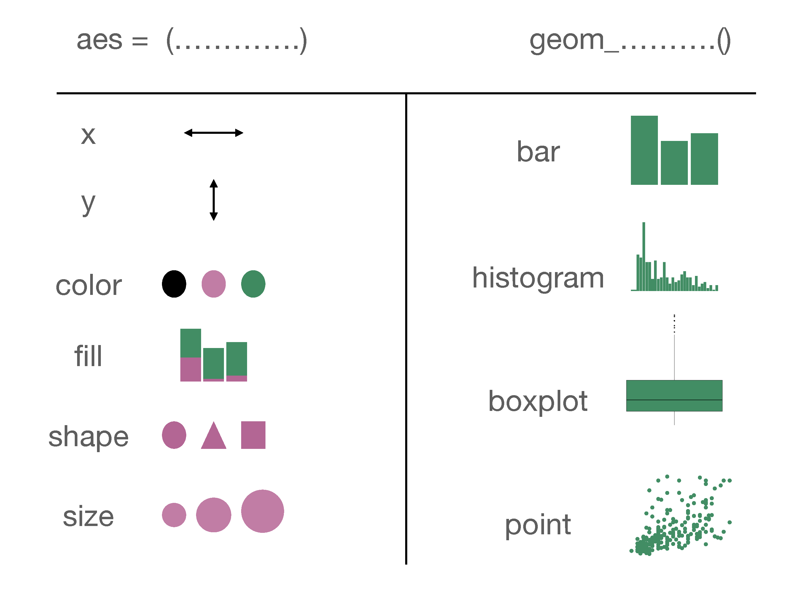
Figure 19: A summary of aesthetics and geom objects covered in this lecture
